Sonic’s Manalink3 Makeover (UPDATED 12th Jan 2013)
Moderators: BAgate, drool66, Aswan jaguar, gmzombie, stassy, CCGHQ Admins
38 posts
• Page 1 of 3 • 1, 2, 3
Sonic’s Manalink3 Makeover (UPDATED 12th Jan 2013)
![]() by Sonic » 10 Dec 2012, 22:46
by Sonic » 10 Dec 2012, 22:46
OK nearly Xmas, here’s a little present for you all.
Some of you may remember I posted a few pics of a game artwork mod I was working on a few months ago. Er… 11 months actually.
Well after lots of mucking about with various ideas, this is the result.
I’ve tried to give the game a more restrained baize tabletop look. Personally I kept thinking all the card art in the backgrounds and menus made the game look a bit messy and confusing, so I’ve gone for a simpler more functional look. Not to everyone’s taste I’ll admit, but at least you have another skin option to play with, or mix and match elements with other available skins.
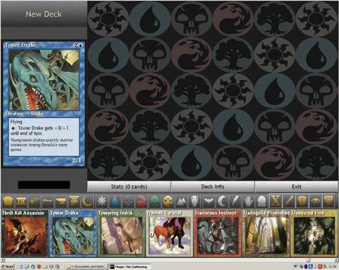
For example, the Attack and Spell screens have been totally redesigned – the card scrolling rat/bones and snail/mushrooms are now replaced by arrow/panels, and all the menus and pop-ups are more or less identical (making allowances for the fixed text colours). As in the original preliminary posted pics, where possible the new pic and bmp files have been produced to larger dimensions in order to increase their on screen resolution. So much of the graphics have a slightly smoother look. The Deckbuilder has had a complete makeover as well, as has the Start-Up screen, and the mod has also been set up to work for the Deckbuilder and Duelling Screen in Shandalar.
You’ll also find both my classic and modern styled card templates in the CardArt folder (modern installed by default).
A point to note – when first installed there is only one terrain background design for all the named backgrounds types (green baize). I chose to do this as there is no way (I could discover) to disable the random switching of the AI opponents backgrounds – so effectively the ‘Your Territory Background’ selector in the ‘Dual Options’ will be disabled with this mods default install.
12th Jan UPDATE: - The default Phase Strips now have a black symbol on a silver background to make the highlighting more obvious. The original and a surround highlighted version are included in the download. These new strips also fix a small error in the symbol alignment in one of the strips.
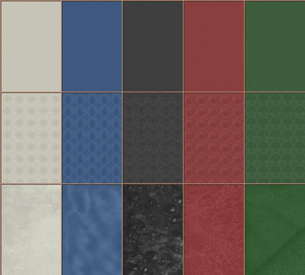
There are now a few Terrain and Face backgrounds to choose from. The original green baize remains the default with a new Face background to match the Life Points black gradient one, but you now have plain colored, mana symbol, and modern card backgrounds to play with which restore the ‘Your Territory Background’ function. See pic.
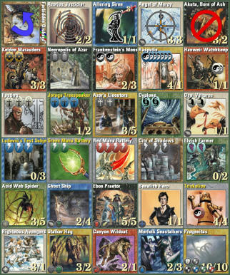
I‘ve also resized all the ‘effects’ card overlays to the same size. See pic.
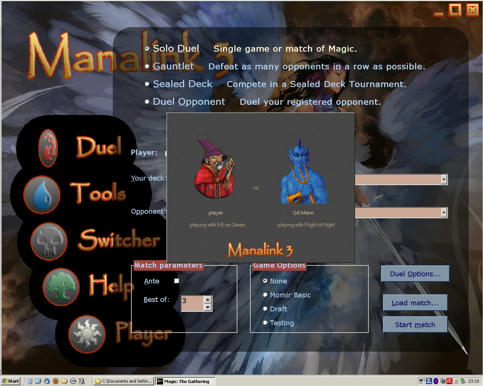
Here are a few mock up pics to give you some idea of the overall look. (Displayed at 1280x1024).
Basic Layout and Mana Menu:
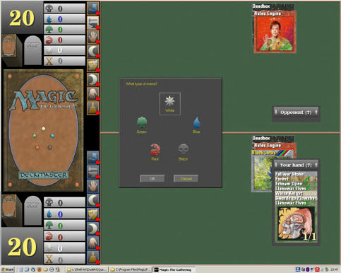
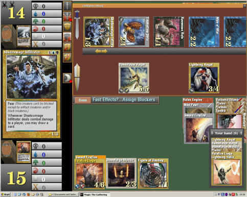
Opponent Attack Screen:
Alternative Backgrounds
Effects, Counters and Abilities Examples:
Startup Screen:
Deckbuilder:
If you are going to install the mod - create a ‘Backup Game Artwork’ folder inside your Magic/Program folder and move all the current artwork folders named in the downloaded ‘ML3Skin 1.2.zip’ file into it before copying the replacement folders in the archive into the Magic/Program folder.
I dare say this will only be a temporary measure, as our good friend CirothUngol will no doubt be along to create a rather useful theme switching utility for you to play with in due course.
UPDATED 12th Jan: ML3Skin 1.2.zip - http://www.mediafire.com/?sj43975bxcfw4vc
Have fun… Sonic Santa
Bah! Humbug.
Some of you may remember I posted a few pics of a game artwork mod I was working on a few months ago. Er… 11 months actually.
Well after lots of mucking about with various ideas, this is the result.
I’ve tried to give the game a more restrained baize tabletop look. Personally I kept thinking all the card art in the backgrounds and menus made the game look a bit messy and confusing, so I’ve gone for a simpler more functional look. Not to everyone’s taste I’ll admit, but at least you have another skin option to play with, or mix and match elements with other available skins.
For example, the Attack and Spell screens have been totally redesigned – the card scrolling rat/bones and snail/mushrooms are now replaced by arrow/panels, and all the menus and pop-ups are more or less identical (making allowances for the fixed text colours). As in the original preliminary posted pics, where possible the new pic and bmp files have been produced to larger dimensions in order to increase their on screen resolution. So much of the graphics have a slightly smoother look. The Deckbuilder has had a complete makeover as well, as has the Start-Up screen, and the mod has also been set up to work for the Deckbuilder and Duelling Screen in Shandalar.
You’ll also find both my classic and modern styled card templates in the CardArt folder (modern installed by default).
A point to note – when first installed there is only one terrain background design for all the named backgrounds types (green baize). I chose to do this as there is no way (I could discover) to disable the random switching of the AI opponents backgrounds – so effectively the ‘Your Territory Background’ selector in the ‘Dual Options’ will be disabled with this mods default install.
12th Jan UPDATE: - The default Phase Strips now have a black symbol on a silver background to make the highlighting more obvious. The original and a surround highlighted version are included in the download. These new strips also fix a small error in the symbol alignment in one of the strips.
There are now a few Terrain and Face backgrounds to choose from. The original green baize remains the default with a new Face background to match the Life Points black gradient one, but you now have plain colored, mana symbol, and modern card backgrounds to play with which restore the ‘Your Territory Background’ function. See pic.
I‘ve also resized all the ‘effects’ card overlays to the same size. See pic.
Here are a few mock up pics to give you some idea of the overall look. (Displayed at 1280x1024).
Basic Layout and Mana Menu:
Opponent Attack Screen:
Alternative Backgrounds
Effects, Counters and Abilities Examples:
Startup Screen:
Deckbuilder:
If you are going to install the mod - create a ‘Backup Game Artwork’ folder inside your Magic/Program folder and move all the current artwork folders named in the downloaded ‘ML3Skin 1.2.zip’ file into it before copying the replacement folders in the archive into the Magic/Program folder.
I dare say this will only be a temporary measure, as our good friend CirothUngol will no doubt be along to create a rather useful theme switching utility for you to play with in due course.
UPDATED 12th Jan: ML3Skin 1.2.zip - http://www.mediafire.com/?sj43975bxcfw4vc
Have fun… Sonic Santa
Bah! Humbug.
Last edited by Sonic on 12 Jan 2013, 04:43, edited 6 times in total.
Working On: Life, the Universe, and Everything.

Re: Sonic’s Manalink3 Makeover
![]() by gmzombie » 11 Dec 2012, 00:33
by gmzombie » 11 Dec 2012, 00:33
i like this. i will do a few mods myself but it will be mostly swapping a few things. but this is cool. i wish though we could get someone to help figure out the windows api and switch it to a modern at least 1280x1024 and a high of 1920x1080 game would look SO much better in high def.
can I maze of ith your snowstorm?
http://home.comcast.net/~gmzombie/index.html old stuff in here. don't use this stuff right now till I get time to get back into it and readjust.
http://home.comcast.net/~gmzombie/index.html old stuff in here. don't use this stuff right now till I get time to get back into it and readjust.
- gmzombie
- Posts: 857
- Joined: 26 Feb 2009, 01:05
- Location: Wyoming, Mi
- Has thanked: 200 times
- Been thanked: 51 times
Re: Sonic’s Manalink3 Makeover
![]() by Aswan jaguar » 11 Dec 2012, 05:26
by Aswan jaguar » 11 Dec 2012, 05:26
Thank you Sonic it looks great as the pictures you have posted earlier promised for it,the anticipation certainly was worthwhile.It is certainly going to be installed in one of my Manalink versions, maybe apart from the no art battleground which is out of my taste. 
Yes,indeed makeover it is.
Yes,indeed makeover it is.
---
Trying to squash some bugs and playtesting.
Trying to squash some bugs and playtesting.
-

Aswan jaguar - Super Tester Elite
- Posts: 8080
- Joined: 13 May 2010, 12:17
- Has thanked: 732 times
- Been thanked: 460 times
Re: Sonic’s Manalink3 Makeover
![]() by stassy » 11 Dec 2012, 11:45
by stassy » 11 Dec 2012, 11:45
I like the main menu animation that refer to the coin flip.
However, a small nitpick is the main combat screen, the average color contrast is quite low, and as such the phase status is quite hard to spot (white grey on grey make it nearly invisible).
The death tag is quite a bit...small, but it depend on taste.
Also maybe it's time to bury the switcher, as for ML3 it is no longer usable or useful?
- stassy
- Moderator
- Posts: 5274
- Joined: 25 Feb 2009, 07:06
- Has thanked: 471 times
- Been thanked: 337 times
Re: Sonic’s Manalink3 Makeover
![]() by ozks » 11 Dec 2012, 12:36
by ozks » 11 Dec 2012, 12:36
i always wondered if this really work or was just remainder of 2.0stassy wrote:Also maybe it's time to bury the switcher, as for ML3 it is no longer usable or useful?
really nice skin, let's see and i tell you...
Thanks!

Re: Sonic’s Manalink3 Makeover
![]() by stassy » 11 Dec 2012, 16:51
by stassy » 11 Dec 2012, 16:51
It does "work" as it's just a batch switch with some Magic.exe / Manalink.csv versions, but doing it now would put you back some years ago in time 
- stassy
- Moderator
- Posts: 5274
- Joined: 25 Feb 2009, 07:06
- Has thanked: 471 times
- Been thanked: 337 times
Re: Sonic’s Manalink3 Makeover
![]() by RanDomino » 13 Dec 2012, 08:04
by RanDomino » 13 Dec 2012, 08:04
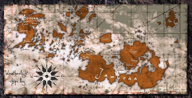
I steal art from various sources, personally. Original borders, symbols from this package, backgrounds from that one... It's easy enough to just drop things in the right place and change names. I even made a different combat phase 'map' background, by twisting this map from Invasion http://s3.gatheringmagic.com/uploads/20 ... _map_2.jpg to 1054x362 (older monitor; YMMV) and changing the left side a little. Slightly better than marching across Ohio.
Re: Sonic’s Manalink3 Makeover
![]() by Sonic » 20 Dec 2012, 01:07
by Sonic » 20 Dec 2012, 01:07
OK, update required.
I discovered I’d missed a number of files out of the archive for the Shandalar dual section, and also forgot to replace a couple of the preliminary test files.
As this prompted the need for an updated archive, I’ve also darkened the ‘sword’ contrast in the phase strips as stassy requested.
Check the first post for the new download.
Working On: Life, the Universe, and Everything.
Re: Sonic’s Manalink3 Makeover
![]() by ozks » 21 Dec 2012, 03:38
by ozks » 21 Dec 2012, 03:38
the phase bars need to update, the active color lost with the base color!Sonic wrote:OK, update required.
I discovered I’d missed a number of files out of the archive for the Shandalar dual section, and also forgot to replace a couple of the preliminary test files.
As this prompted the need for an updated archive, I’ve also darkened the ‘sword’ contrast in the phase strips as stassy requested.
Check the first post for the new download.
sweet! thanks
Re: Sonic’s Manalink3 Makeover (UPDATED 20th Dec)
![]() by Sonic » 25 Dec 2012, 01:18
by Sonic » 25 Dec 2012, 01:18
Sorry, slightly lost in translation.ozks wrote:the phase bars need to update, the active color lost with the base color!
But if I'm reading this right, there seems to be a general consensus that the phase bars/strips don't have enough colour contrast to differentiate the phase symbols when their backgrounds are highlighted?

I'm slightly confused - the strips look fine here on my old 19" CRT monitor. So I'm at a loss why this is.

Unless you're all using LCD/LED panels and their contrast resolution is utter rubbish.

Working On: Life, the Universe, and Everything.
Re: Sonic’s Manalink3 Makeover (UPDATED 20th Dec)
![]() by stassy » 25 Dec 2012, 10:48
by stassy » 25 Dec 2012, 10:48
After your last update the phase bar constrast is visible, the color bending is not my cup of tea but it fit the theme "playing in a casino table at a tournament" very well
- stassy
- Moderator
- Posts: 5274
- Joined: 25 Feb 2009, 07:06
- Has thanked: 471 times
- Been thanked: 337 times
Re: Sonic’s Manalink3 Makeover (UPDATED 20th Dec)
![]() by ozks » 26 Dec 2012, 22:38
by ozks » 26 Dec 2012, 22:38
hahaha that's what i meant, i check the update thanks...Sonic wrote:Sorry, slightly lost in translation.ozks wrote:the phase bars need to update, the active color lost with the base color!
But if I'm reading this right, there seems to be a general consensus that the phase bars/strips don't have enough colour contrast to differentiate the phase symbols when their backgrounds are highlighted?
I'm slightly confused - the strips look fine here on my old 19" CRT monitor. So I'm at a loss why this is.
Unless you're all using LCD/LED panels and their contrast resolution is utter rubbish.
when i get home!
by the way, the startup screen looks amazing and the effect of the symbols....
Re: Sonic’s Manalink3 Makeover (UPDATED 20th Dec)
![]() by CirothUngol » 06 Jan 2013, 06:21
by CirothUngol » 06 Jan 2013, 06:21
You betcha!Sonic wrote:I dare say this will only be a temporary measure, as our good friend CirothUngol will no doubt be along to create a rather useful theme switching utility for you to play with in due course.
Sorry for the recent MIA, but I've spent several months on a couple of other projects (you can try to download one of them Here). I've gleened through the forums for all of the recent updates and I'm assembling a final 2012 release for Manalink 3.0 20121111v2 right now.
I love the new ShellScreen and the CoinFlip animations, great job! All of the DeckBuilder\DuelArt is also really nice... modern, simple, and sleek. I'll stick with the current default art for the final 2012 release, but this is sure to be the default for 2013 (and I'll include Sarlack's as an ArtMod).
Here's a thought:
If you'll create .\DuelArt\Terr_*.bmps in the other four colors just like the green one you've included, I'll make the ArtMod.exe selectable... allowing the user to choose which color or all five. I could default to Green if you'd like. Maybe?
"I thought the day had brought enough horrors for our ragged band, but the night was far worse."
-Lucilde Fiksdotter
Shandalar 2012 Revisited
Magic: The Gathering Abandonware
-Lucilde Fiksdotter
Shandalar 2012 Revisited
Magic: The Gathering Abandonware
-

CirothUngol - Programmer
- Posts: 431
- Joined: 13 May 2009, 21:34
- Location: Gulf Coast, Texas, USA
- Has thanked: 106 times
- Been thanked: 107 times
Re: Sonic’s Manalink3 Makeover (UPDATED 20th Dec)
![]() by Sonic » 06 Jan 2013, 15:57
by Sonic » 06 Jan 2013, 15:57
I knew I could rely on you to come up with a solution.CirothUngol wrote:You betcha!Sonic wrote:I dare say this will only be a temporary measure, as our good friend CirothUngol will no doubt be along to create a rather useful theme switching utility for you to play with in due course.
Sorry for the recent MIA, but I've spent several months on a couple of other projects (you can try to download one of them Here). I've gleened through the forums for all of the recent updates and I'm assembling a final 2012 release for Manalink 3.0 20121111v2 right now.
I love the new ShellScreen and the CoinFlip animations, great job! All of the DeckBuilder\DuelArt is also really nice... modern, simple, and sleek. I'll stick with the current default art for the final 2012 release, but this is sure to be the default for 2013 (and I'll include Sarlack's as an ArtMod).
Here's a thought:
If you'll create .\DuelArt\Terr_*.bmps in the other four colors just like the green one you've included, I'll make the ArtMod.exe selectable... allowing the user to choose which color or all five. I could default to Green if you'd like. Maybe?
I'll investigate the coloured background option. I did try a few alternative background colours to match the mana symbol colours when I was experimenting - but in single coloured blocks their effect was slightly overwhelming. which is why I finally decided on the green as it reminded me more of the green baize you commonly find on a card table. The maroon and blue for the attack and spell screens seemed like a reasonable alternatives as I'd remembered seeing pool tables these colours.
Hold off on the compiling the 2013 release for a few days, as I need to update the phase strips again. The original consensus was that the symbols don't have enough contrast when highlighted - so I've made some alternative strips so people can choose the one they like.
The new strips also fix a couple of small symbol alignment errors in the Player symbols.
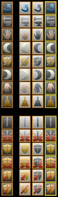 The left strip is the same as the current unselected phase and combat strips.
The three on the right will be the highlight alternatives. The first is the current highlight strip, the second uses black symbols in contrast to the silver background, and the last just uses a slightly thicker yellow Player/AI surround border to highlight the active phase.
I'm thinking the one with the black symbols should be the new default.
Anyway, I'll set to work and get back in a few days with an update.
Working On: Life, the Universe, and Everything.
38 posts
• Page 1 of 3 • 1, 2, 3
Who is online
Users browsing this forum: No registered users and 10 guests