MTGO Masters Editions
Discuss Card Scans and Other Artwork Here
Moderator: CCGHQ Admins
MTGO Masters Editions
![]() by charlequin » 18 Nov 2016, 20:41
by charlequin » 18 Nov 2016, 20:41
Did anyone ever do 300 DPI renders of these? I'm in possession of XLHQ renders of Vintage Masters and Tempest Remastered now, these are the remaining online-only booster releases.
- charlequin
- HQ Team Member
- Posts: 644
- Joined: 15 Oct 2008, 18:34
- Has thanked: 66 times
- Been thanked: 1172 times
Re: MTGO Masters Editions
![]() by ahkren » 15 Dec 2016, 21:49
by ahkren » 15 Dec 2016, 21:49
I have all the Masters Editions rendered, but I don't have all the high res art for the cards. I can continue to look for high res art and rerender the sets when I have them. All four of the Masters Editions are in HQCG with current gatherer text, is that what would be preferred or original text?
-

ahkren - Programmer
- Posts: 316
- Joined: 18 Jan 2012, 20:43
- Has thanked: 50 times
- Been thanked: 201 times
Re: MTGO Masters Editions
![]() by charlequin » 15 Dec 2016, 22:55
by charlequin » 15 Dec 2016, 22:55
I was hoping to do them with period-appropriate text. I actually snagged downloads of old Oracle off of the Wayback Machine for this purpose, I just haven't gotten around to actually parsing them into something your card gen can read yet. I could share the files up.ahkren wrote:I have all the Masters Editions rendered, but I don't have all the high res art for the cards. I can continue to look for high res art and rerender the sets when I have them. All four of the Masters Editions are in HQCG with current gatherer text, is that what would be preferred or original text?
In terms of the art I was intending to just use the scanned XLHQ art rather than try to locate original images for everything, since 100% of the art in these sets is based on paper releases.
- charlequin
- HQ Team Member
- Posts: 644
- Joined: 15 Oct 2008, 18:34
- Has thanked: 66 times
- Been thanked: 1172 times
Re: MTGO Masters Editions
![]() by ahkren » 16 Dec 2016, 05:42
by ahkren » 16 Dec 2016, 05:42
If you have the original text that would save a bunch of time. I'll pull together something to parse the file into something for cardgen. I can then pull the XLHQ art for each of the cards into the proper folders and do the render.
-

ahkren - Programmer
- Posts: 316
- Joined: 18 Jan 2012, 20:43
- Has thanked: 50 times
- Been thanked: 201 times
Re: MTGO Masters Editions
![]() by charlequin » 16 Dec 2016, 08:19
by charlequin » 16 Dec 2016, 08:19
Sent the older Oracle versions I was looking at over.
- charlequin
- HQ Team Member
- Posts: 644
- Joined: 15 Oct 2008, 18:34
- Has thanked: 66 times
- Been thanked: 1172 times
Re: MTGO Masters Editions
![]() by skibulk » 19 Dec 2016, 14:20
by skibulk » 19 Dec 2016, 14:20
Assuming these have modern frames within MTGO...
I disagree with using original text for these. To date Wizards has never used legacy text on newly released cards. Modern reprint sets like Modern Masters use the M15 card frames and oracle text. Our goal has always been to represent cards as they are printed, and while digital cards are a different beast, I think they should be represented with oracle text at the time of their release. That's just my opinion, and it really doesn't matter one way or anther when it comes down to the release. Maybe we can do both?
FYI the Gatherer pages have a "Printed" text tab, which in theory should the original text rather than the oracle text. Although I believe it's only accurate for 7ED and on.
-

skibulk - HQ Team Member
- Posts: 995
- Joined: 19 Jul 2010, 20:34
- Location: Northeast USA
- Has thanked: 379 times
- Been thanked: 335 times
Re: MTGO Masters Editions
![]() by charlequin » 19 Dec 2016, 16:35
by charlequin » 19 Dec 2016, 16:35
To be clear, I pulled down Oracles from 2007 - 2010 to try to get card texts as close as possible to what they would have been at the time of each Masters Edition release. I couldn't find a source with a full history of all Oracle changes, but these texts should be within a few months of each digital release.skibulk wrote:I disagree with using original text for these. To date Wizards has never used legacy text on newly released cards. Modern reprint sets like Modern Masters use the M15 card frames and oracle text. Our goal has always been to represent cards as they are printed, and while digital cards are a different beast, I think they should be represented with oracle text at the time of their release.
EDIT: akhren, I realized while answering a different unrelated thread that this might be much simpler than I thought. mtgjson.com has json files for all four of the Masters Edition sets with "original text" fields populated. Based on just a couple spot checks, it appears that this original text field is accurate to their digital release.
- charlequin
- HQ Team Member
- Posts: 644
- Joined: 15 Oct 2008, 18:34
- Has thanked: 66 times
- Been thanked: 1172 times
Re: MTGO Masters Editions
![]() by skibulk » 19 Dec 2016, 17:45
by skibulk » 19 Dec 2016, 17:45
Okay that's how I think it should be. I miss-read your post. Thanks.
-

skibulk - HQ Team Member
- Posts: 995
- Joined: 19 Jul 2010, 20:34
- Location: Northeast USA
- Has thanked: 379 times
- Been thanked: 335 times
Re: MTGO Masters Editions
![]() by ahkren » 19 Dec 2016, 22:34
by ahkren » 19 Dec 2016, 22:34
@charlequin the json is looking to be much easier to parse, thanks! I'll have something for people to look over by tomorrow as long as I don't run into something unforeseen.
-

ahkren - Programmer
- Posts: 316
- Joined: 18 Jan 2012, 20:43
- Has thanked: 50 times
- Been thanked: 201 times
Re: MTGO Masters Editions
![]() by ahkren » 20 Dec 2016, 00:33
by ahkren » 20 Dec 2016, 00:33
Removed
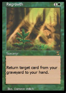
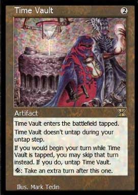
Here's a subset of Masters Edition in Eighth Edition frames. Let me know what you think or if I should do Pre8th frames. I will put on a full border when I do the complete render.
Here's a subset of Masters Edition in Eighth Edition frames. Let me know what you think or if I should do Pre8th frames. I will put on a full border when I do the complete render.
Last edited by ahkren on 22 Dec 2016, 01:29, edited 1 time in total.
-

ahkren - Programmer
- Posts: 316
- Joined: 18 Jan 2012, 20:43
- Has thanked: 50 times
- Been thanked: 201 times
Re: MTGO Masters Editions
![]() by charlequin » 20 Dec 2016, 04:26
by charlequin » 20 Dec 2016, 04:26
I think the Masters Edition cards were all released on MTGO in the 5E era borders, actually, rather than the 8E ones, e.g. from an ME4 preview article:


For 5E cards, the frame itself before any black borders should come out to 670 x 960.
Text rendering all looks great.


For 5E cards, the frame itself before any black borders should come out to 670 x 960.
Text rendering all looks great.
- charlequin
- HQ Team Member
- Posts: 644
- Joined: 15 Oct 2008, 18:34
- Has thanked: 66 times
- Been thanked: 1172 times
Re: MTGO Masters Editions
![]() by ahkren » 20 Dec 2016, 09:01
by ahkren » 20 Dec 2016, 09:01
I'll change the frames to the Pre8th borders.
-

ahkren - Programmer
- Posts: 316
- Joined: 18 Jan 2012, 20:43
- Has thanked: 50 times
- Been thanked: 201 times
Re: MTGO Masters Editions
![]() by ahkren » 20 Dec 2016, 21:26
by ahkren » 20 Dec 2016, 21:26
Having some issues with the PT positioning on Angry Mob, but the others look good. Here is the first run of Masters Edition with borders. Removed If this gets the OK, I'll do the other sets in the same style.
Edit: Fixed Angry Mob. Should be good now.
Edit: Fixed Angry Mob. Should be good now.
Last edited by ahkren on 22 Dec 2016, 01:29, edited 1 time in total.
-

ahkren - Programmer
- Posts: 316
- Joined: 18 Jan 2012, 20:43
- Has thanked: 50 times
- Been thanked: 201 times
Re: MTGO Masters Editions
![]() by skibulk » 21 Dec 2016, 00:46
by skibulk » 21 Dec 2016, 00:46
Some of the artwork looks heavily compressed. Are you using all digital versions, even if the quality is low? Can we substitute card scans where the quality is <250 DPI?
I'm not sure how you're searching for art, but I would like to suggest dropping low res jpgs into google images and tineye - to search for high res versions.
Edit: Shouldn't Angry Mob be "*/*"? I realize the original was *+2, but this is a reprint set and with the centered copyright line, it collides.
-

skibulk - HQ Team Member
- Posts: 995
- Joined: 19 Jul 2010, 20:34
- Location: Northeast USA
- Has thanked: 379 times
- Been thanked: 335 times
Re: MTGO Masters Editions
![]() by ahkren » 21 Dec 2016, 01:33
by ahkren » 21 Dec 2016, 01:33
I have all the scans on my desktop at home, I've been working with what I have on the laptop at the moment. I'll replace the artwork before I do a final render.
For Angry Mob, all gatherer versions have it at 2+*/2+*, originals and current oracle text. Agreed it looks strange with the centered copyright. The options I have are to change it to */* as you suggest (which wouldn't match the printings), shrink the font (which looks odd), left align the copyright and artist lines to more match the original (which wouldn't match the rest of the set), or move the PT and copyright text a couple of pixels farther away from each other. I am open to suggestions for what would look best.
For Angry Mob, all gatherer versions have it at 2+*/2+*, originals and current oracle text. Agreed it looks strange with the centered copyright. The options I have are to change it to */* as you suggest (which wouldn't match the printings), shrink the font (which looks odd), left align the copyright and artist lines to more match the original (which wouldn't match the rest of the set), or move the PT and copyright text a couple of pixels farther away from each other. I am open to suggestions for what would look best.
-

ahkren - Programmer
- Posts: 316
- Joined: 18 Jan 2012, 20:43
- Has thanked: 50 times
- Been thanked: 201 times
Who is online
Users browsing this forum: No registered users and 38 guests
